Web Design Trends 2012 | Web Design Course Singapore

Discover The Latest Web Design Trends 2012 And Be On Top
Human tastes change all the time, and so do web design trends. Every year, we see new shifts or re-interpretation of old patterns.
In many of my web design courses, participants ask me whether there are shifts in web design trends in 2012.
My usual answer is : If you are a designer, yes, you should know what the latest web design trends are. But if you are a business man – your worry shouldn’t be in web design trends in 2012. A beautiful or trendy website doesn’t get you more mileage, unless your website has something to do with designs or arts.
Anyway, this article is strictly for those who are interested in web design trends for the sake of trends… don’t get too caught up with trends unless you are a designer, ok? 🙂 Having said that, there are some trends that do affect business and I will highlight them below.
1) Getting Mobile compatible
In recent years, minimalistic designs have gained immense popularity. It is foreseen that this web design trend will continue into 2012. You might have noticed that more and more people are searching for info and websites through their mobile phones. It’s no surprise therefore that certain research studies revealed that over 1/5th of the web searches intended to be carried out will be done through mobile devices this year. Making the websites mobile compatible is a smart move you should think seriously about, and the most practical web design trend in 2012, and will help bring exponential growth in business.
2) Oversized Headers and Logos
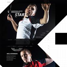
These create an big impression on the visitors. Frankly, this has always been popular in some ways, and is not a web design trend specifically set for 2012 but this year, we see lots of designers start using oversized logos or headers in order to promote their websites or companies. However it’s not only about promoting, once the design is successful it could be quite an eye-catch and might get the attention of the website visitors.
For years due to poor navigation of some websites, users may have clicking phobia but oversized headers and logos do not require visitors to click anything except to scroll down.
3. Social Media
 These days, everyone talks about Social media. Naturally, the web design trend in 2012 will see Social Media sites as Facebook , Twitter and Google+ having increased presence on websites. This will enable easier sharing of information easier AND helps to drive traffic to a website, meaning good news for businesses.
Evolution of new web design trends is a continuous process and 2012 will see emergence of new technology that is sure to bring a revolution in the web world.
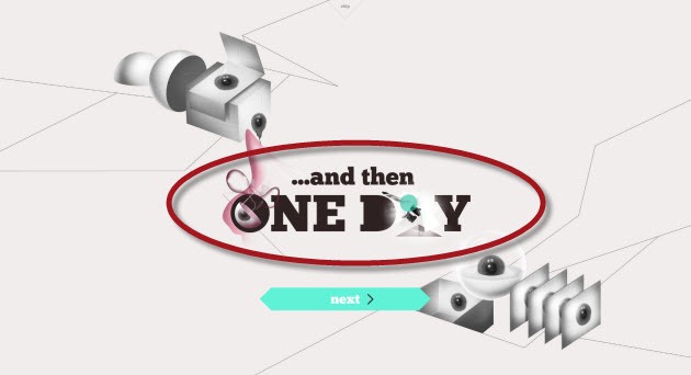
4. Interactive and Intuitive Design, More 3D Effects
Presenting important information as simple as possible, with the right use of typography and overall design will definitely create a fantastic experience for visitors to your user friendly website. This is yet another important web design trend for the year 2012.
3D effects add depth to the perception of your website. Playing with colors, gradients and other tricks will make your design interactive and this trend will continue to rise, (just like in the movies!), due to its awesome ability to impress and engage visitors.
5. Typography
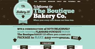
Today many web browsers support different types of font that is why it has become possible to use lettering in a creative manner. Typography has already become an important part of web design trends.
Use of creative fonts is being discussed in business circles and many websites are in the process of mixing fonts to come up with a masterpiece that is sure to make web more interactive and engaging. Expect to see bold, original, never seen before typography as part of this year’s web design trend.
6. Minimalism
Everyone knows Google advocates focusing on user experience – hence “keep it simple” is a natural new web design trend.
Users are comfortable searching for the content they need when it is simple and user friendly, this is why a lot of designers tend to keep their design minimal, without overcrowding it with all types of stuff and elements that are not quite needed. Minimalism in shapes, features and taxonomies is catching on, the number of websites overcrowded with information and graphics becoming smaller day by day.
7. One Page Layouts
In line with minimalism is one page layouts as the latest web design trends. Think of website as ‘business cards’ which allows people to find you at work and various blogs. This one page layout shows your photo and info about you and where and how to find you, for example. This type of layouts are suitable for personal profiles more than for corporates but these days enterpreneurs are making larger imprints on business.
Remember : If you are a businessman, focus on the website quality (contents) rather than on website design only.
Web Design Trends Change All The Time – focus on your website quality instead.
Recommended Reading :
How To Create Your Website in 5 Steps
Web Design Course Video Training
Or Sign Up For Our Most Popular Workshop :


 I am a newbie and knows nothing about Web Design. So scare that I cannot catch up but I am very surprised that I can do a reasonably nice website within 2 days. Finally I attended not only Web Design course but also SEO Mastery course with Scott Tan. Very approachable & experienced trainer. He is also very generous in giving free tips.